 Setup: Preferences
 Setup: Preferences
The system allows each workstation to set Preferences for the way the accounting program operates. These items are machine-specific. In other words, anyone who logs in to the program using this machine will get these preferences.
Select Preferences from the Setup and the following screen will come into view. The Miscellaneous tab is selected by default.


Change Font (button)
Use this option to change to a larger font for displaying program windows. A standard Windows font dialog box will appear. Choose the font name and the font size. When OK is pressed, the window will be redisplayed using the new style and size. For example, here is the current window displayed using a 12 point Times font:

Restore Default Font (button)
Click this button to return the window display to the standard font style and size.
Automatically Download Internet Updates (check box)
If this box is checked, the system will automatically check the www.a-systems.net website for new program updates each time the program is run. If updates are found they will be downloaded automatically and installed the next time the software is restarted.
Show Announcements During Login (check box)
If this box is checked, special A-System's announcements such as user conferences will be displayed at the login screen.

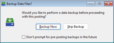
Prompt for Data Backup Prior to Posting (check box)
Select this option and the following screen will appear any time a Post button is pressed.
Throughout the program there are many text entry fields that can store your entries to be retrieved later. If this box is checked, this feature will be enabled.
Occasionally the program will display a warning message and produce an audible warning (computer sound). If this box is unchecked, the audible warnings will no longer sound.
Confirm when canceling entry windows (check box)
This setting refers to windows used for enering information like vendors, customer, jobs, invoices, timesheets, etc. When a record is being added or changed, the information that has been entered so far can be cancelled by clicking the Cancel button or the red X at the top of the window, or by pressing the Esc key on the keyboard. Regardless of which method is used to cancel, the system will ignore the information that has been entered and return focus to the previous window. If this box is checked, the system will ask the user for confirmation when they attempt to cancel an entry. A window like this one will be displayed:

If this box is not checked, the system will cancel the changes without asking for user input.
Display Stylized Controls (check box)
Select this option to display stylized version of controls such as scroll bars, buttons, frames, etc.
Preserve Window Locations & Sizes and List Box Column Widths (check box)
If this box is checked, the system will remember the size and location of individual windows. For example, if the employee entry window is moved to the right side of the JobView main window and stretched to maximum height, the next time that window is opened it will be in the same location and at the same size it was when it was last closed.
For list boxes, many of the columns are resizeable. If columns in a list box are resized, the system will remember the column sizes the next time the window is opened. To restore the column widths to their natural state, click the Restore Columns button  located at the bottom left corner of the list box. Only list boxes with the Restore Columns button have this feature enabled.
Open Windows at Maximum Height (check box)
If this box is checked, many windows will be opened at the maximum height allowed within the main screen. Many windows contain list boxes which can contain a large number of entries. Opening windows at maximum height allows the user to view as many entries as possible simultaneously.
The program allows individual procedures to be accessed from the icon bar on the left using either of two different menu systems. The Popup menu is a traditional menu that appears when the icon button is pressed and disappears when a selection is made. When this menu system is selected, the user can open more than one procedure at a time. The Permanent menu shows all procedures for the selected module in a "tree" format. Submenus can be expanded or contracted according to the user's preference. When a menu item is selected from the permanent menu, the menu does not disappear, but stays put with the last procedure highlighted. When this menu system is selected,the user cannot open more than one procedure at a time. The state of the menu is remembered by the system so that the next time a menu is activated, the same submenus are expanded and the most recently run procedure is highlighted.

Select Popup style menus or Permanent menus. For Permanent menus, the buttons at the top right corner of the menu can be used to modify the menu. The < key contracts all submenus. The > key expands all submenus. The x key closes the menu.
When Permanent menus are selected, the menu color can be set to White or the System background color. Check the Full Height check box to show menus at the full window height.
Allow multiple windows to be opened at a time (check box)
Check this box and users will be allowed to open multiple procedure windows at the same time.
The user may opt to use a conventient menu system called Work Flow Menus. These menus remain open in the background, and each menu option is represented by a labeled tile.

Display Work Flow Menu (checkbox)
Check this box to make the Work Flow Menu window available during system operation. Each time a menu icon on the left side of the window is pressed, in addition to the application menu being displayed, the Work Flow Menu window will also be opened if it is not already open.
Open Work Flow Menu on system startup (checkbox)
If this box is checked, the Work Flow Menu window will be displayed immediately upon system startup, displaying the Default Work Flow Menu selected above.
Default Work Flow Menu (drop-down list box)
Select which work flow menu will be opened by default. If "Most Recent" is selected, each time the sofware is run, the system will remember the last Work Flow Menu that was open the last time the system was closed, and re-open that menu.
Work Flow Wallpaper (drop-down list box)
If desired, select a wallpaper image from the drop-down list. When an image is selected, the Work Flow Menu mockup above will preview how the image will look on the Work Flow Menu. If "Random" is selected, each time a new work flow menu is displayed, the wallpaper image will be changed. If "User Defined" is selected, the user will be able to select a custom image for the wallpaper. Any custom wallpaper image must be saved in Windows Bitmap (.bmp) format, and should already be resized to fit the Work Flow Menu window (1050 x 530 pixels).
The program allows the user to specify which menu icons should be displayed when they run the program, and the order in which the menu items should appear. For example, an entry clerk whose responsibilities are limited to entering Accounts Payable Invoices and Payroll Timesheets may choose to exclude all icons for modules that he never accesses.

Unused Menus (list)
This list contains the menu items that will NOT be displayed.
Menus to be Displayed (list)
This list contains the menu items that WILL be displayed, in the order in which they will be displayed.
Move menu items (buttons)
Use these buttons to move menu items from one list box to the other.
Move menu items up/down (buttons)
Use these buttons to change the order of menu items in the Menus to be Displayed list.
Double-click and Drag & Drop
Menu items can be moved from one list to the other by double-clicking a menu item or dragging a menu item from one list to another. The order of menu items in the Menus to be Displayed list can also be changed by dragging a menu item up or down in the list.
Menu Icon Set
Select the menu icon set that is to be used. Selecting "Icons" will display pictures representing each module. Selecting "Acronyms" will display acronym icons for each module.
The program allows the user to select the wallpaper background to be displayed within the main window. This selection is stored on the individual computer, so each user on a networked installation can view their own wallpaper if desired.
To change the wallpaper setting, first select Setup from the main menu. Next select Preferences, then Wallpaper. The following screen will come into view:

Select a Background
The system comes complete with a number of different background patterns. Select one of the patterns and it will be displayed in the example screen on the left.
User Defined
If User Defined is selected, the following entry prompt will appear:

Image File
Enter the path and filename of the image file to be used for the background wallpaper. Pressing the lookup button (...) will display a standard Windows file selection dialog box.
Display
Select Centered, Tiled, or Stretched for the display mode. The pattern will be updated in the example screen on the left.
If the OK button is pressed, the selected wallpaper will be applied to the main window. If the Cancel button is pressed, the wallpaper will retain its current setting.
The program allows the user to specify whether certain information entry windows should use the simplified entry wizard.

For each listed entry window, indicate whether the entry wizard should be used. In the simplest terms, an entry wizard changes the entry window slightly to allow for a more sequential wizard-style flow. Only a portion of the entry window is visible at any given time, and buttons are provided for the Next and Previous portions of the entry screen. The OK button changes to the traditional Finish button.
From the Icon Bar at the top of the main window, the user can click an icon titled Reminders. This is a system-generated list of reminder items that changes from day to day, depending on the time-sensitive nature of transactions and other data in the system. The settings on this tab will determine what information will be displayed in the Reminders window for the current user.

Reminder Type (List)
This list box includes all the possible reminder types. Each reminder type is displayed with a display setting (Detail, Summary, or Do Not Display) and possible parameters. For example, in the graphic above, the first reminder type is called Accounts Payable Invoices to Pay. Highlight this reminder type and click Change, the following window will appear:

Display in Summary (radio option)
The invoices in this reminder type will NOT be diplayed individually, but the heading will be displayed with a total of the invoice amounts of the included invoices.
Display in Detail (radio option)
The reminder type heading will be displayed with a total amount for all invoices, and each invoice will be displayed.
Do Not Display (radio option)
This reminder type will not be displayed at all.
Parameters
Some of the reminder types have a parameters setting. In the case of Accounts Payable Invoices to Pay, the required parameter is the number of days before due date.
ListBoxes
Email settings for (User name)
There are many places within the system where the operator can send an email message directly from the accounting system. In particular, every time a report is previewed, a button is available to allow a PDF version of the report to be emailed. In these cases, it would be advantageous to have the program automatically insert the email address of the sender as well as a saved email signature.
Email Address
Enter the email address of the listed user.
Signature Block
Enter a block of text to be used as a signature for emails sent using the accounting program.

Report Colors
All of the system reports can be enhanced with a splash of color using this option. This includes specific colors for the Report Title, a Header Shading bar, and the Report Footer Text. A-Systems has designed a few color combinations. Pull down the Theme list box to select from a list of predefined color schemes or to select User Defined.
Predefined Themes
Select any of the predefined color themes and the report mockup on the right will display an example of the selected color theme.
Default Theme
This is the traditional theme for system reports. All text is printed in black, and there is no Header Shading bar.
User Defined Theme
If this option is selected, the user can pick the colors for the three settings. To change a color, just click on the color block next to the setting type and select a color using the standard Windows color selector dialog.
Report Preview Inital State
Select the desired initial size of previews. Experiment with different settings to find the most pleasing state. The pixel resolution of the computer monitor will play a big role in which setting should be selected. Below are examples of the three initial report states on a monitor with a resolution of 1280 by 800 pixels:
Full Width

Full Height

100 Percent

Folder for PDF from Report Previews
When report previews are generated, a button at the top will allow the report to be converted to a PDF. When that PDF is created, it will be stored either in the Company Data folder, or a different folder for this user as specified here under “Custom:”.

Greenbar Effect in List Boxes (radio buttons)
All the list boxes in the system have a slight greenbar effect. This allows for easier reading of the contents of the list box. The user has the ability to remove the greenbar effect or display the effect using the default color or a color of their choice.
Default (radio button)
Select this option to have every other row in the list box highlighted with a background color that coordinates with the other system colors in the windows environment.
None (radio button)
Select this option to have NO highlighting of rows.
User Defined (radio button)
Select this option to allow for the user to choose what the background highlight color will be for every other row in the list boxes.
Color Selector
Click on the color box to the right of the User Defined option and the standard Windows color selector dialog box will appear. Use the box to select the desired color. Since this will be a highlight, we recommend that a VERY LIGHT color is selected. When a color is selected, the sample list box below will show the effect of the selected color.